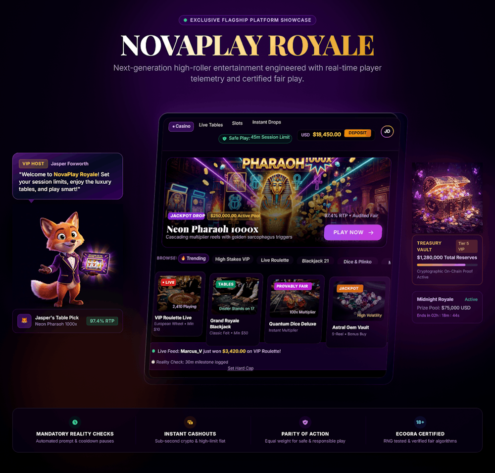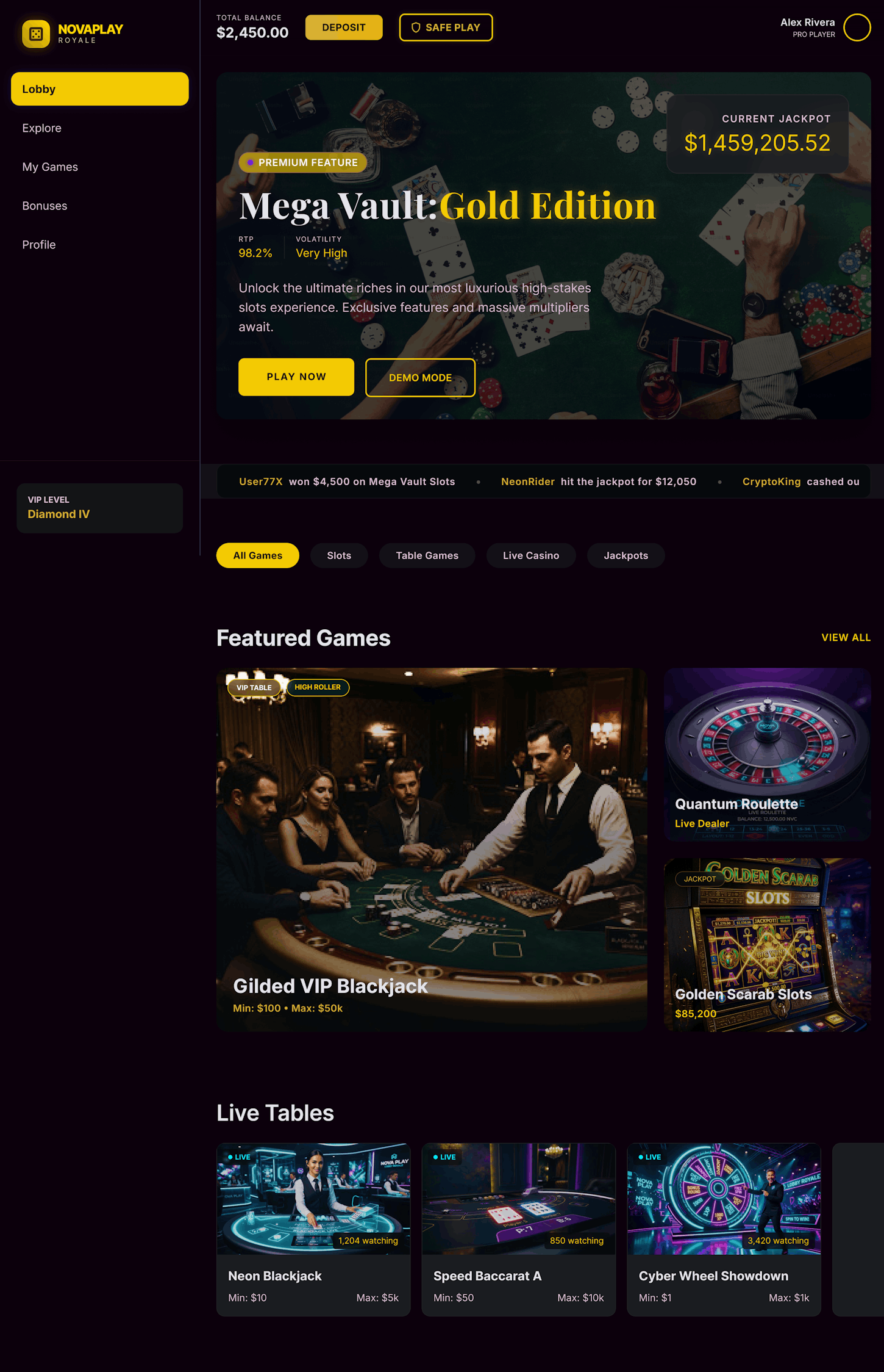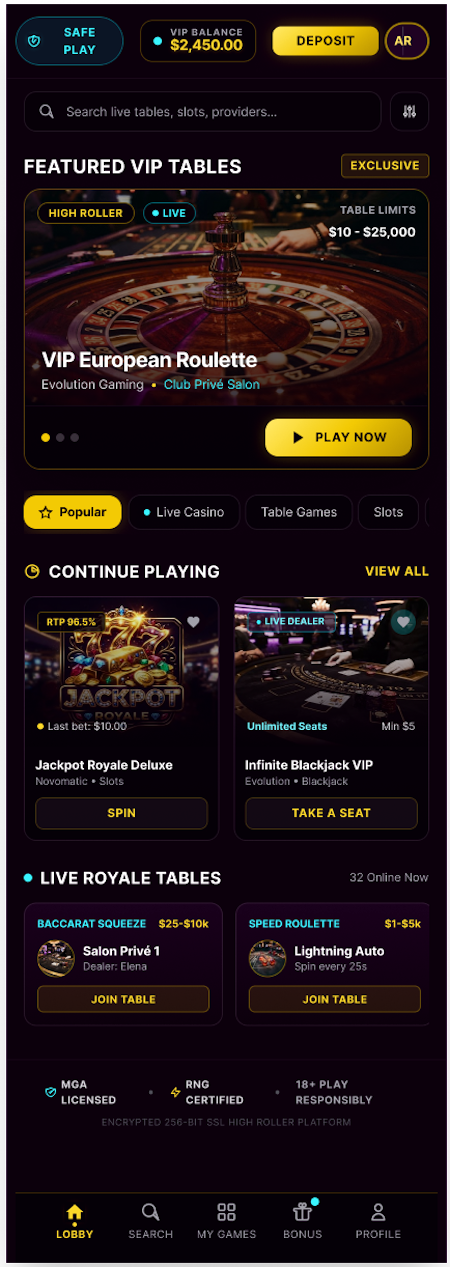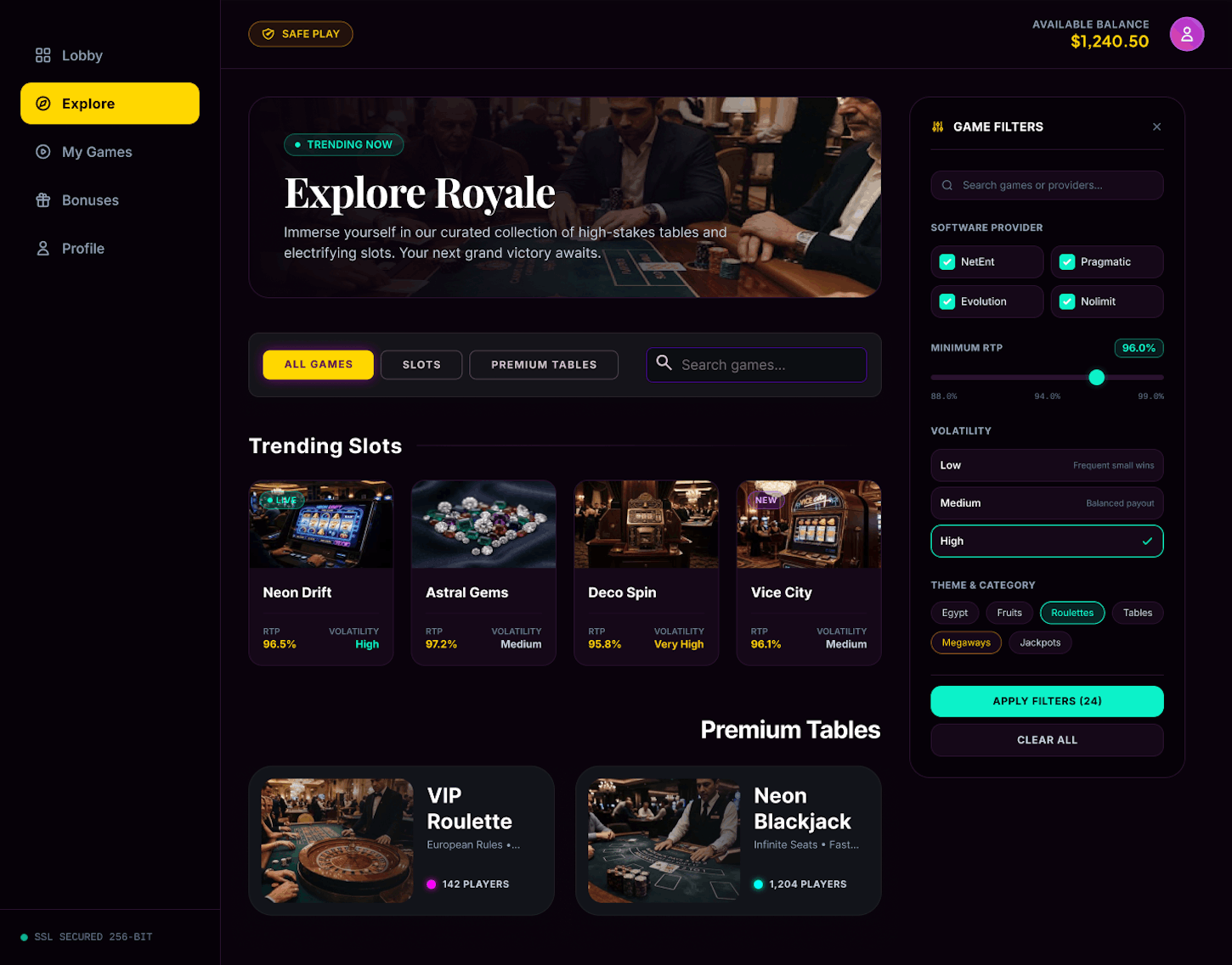

The online gambling industry has perfected one flow:
getting your money in.
Deposits take seconds.
But the tools meant to help players stay in control — spending limits, self-exclusion, session reminders — are often buried several menus deep.
Industry audits have found players can fund an account in under 8 seconds, while locating a deposit-limit tool can take over 4 minutes.
Regulators and journalists across the UK, EU, and Australia are increasingly calling this asymmetry out by name: a dark pattern.
NovaPlay is built around one question:
What if responsible gambling got the same design attention as the deposit button?
- Deposits are frictionless. Withdrawals and limits are not. The same asymmetry shows up across audited apps again and again.
- Responsible-gambling tools exist, but they're hidden — treated as a legal requirement to satisfy quietly, not a feature to design well.
- Regulatory scrutiny is rising, moving from static checkbox requirements toward algorithmic monitoring and staged intervention.
-The real cost is churn, not fines. Players don't complain about friction — they leave. Retention is a trust problem before it's a features problem.
The industry treats responsible gambling as something to minimize.
NovaPlay treats it as something to design.
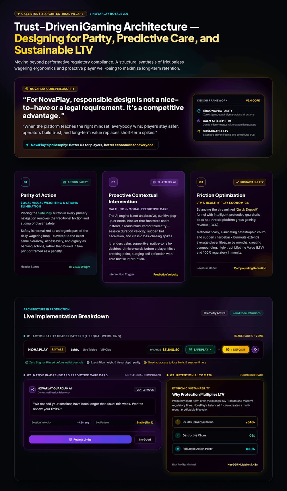
For NovaPlay, responsible design is not a nice-to-have or a legal requirement.
It’s a competitive advantage.
When the platform teaches the right mindset, everybody wins:
Players stay safer, operators build trust, and long-term value replaces short-term spikes.
NovaPlay's philosophy:
Better UX for players, better economics for everyone.
Principles:
Parity of visibility — safety controls get the same visual weight as spending.
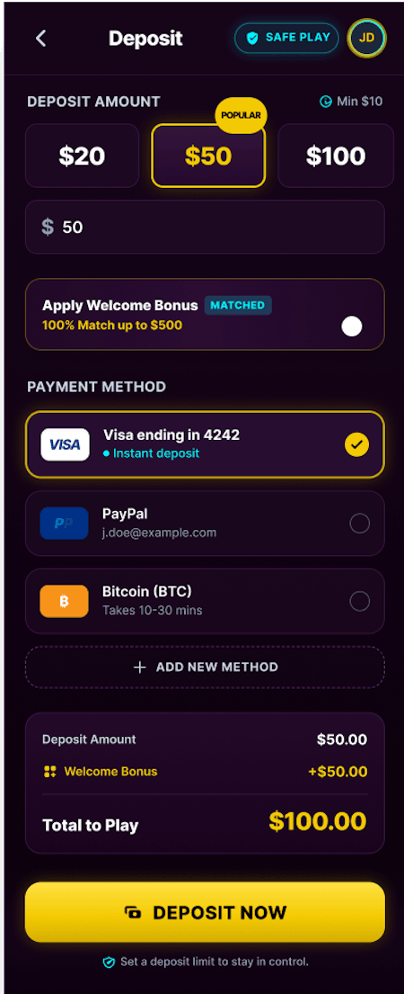
Progressive trust — ask for only what's needed, and explain why.
One system, many skins — every component holds up re-themed, not just in one mockup.
Clarity over cleverness — no ambiguity, anywhere, about limits, fees, or timing.
First impression, before a single game opens.
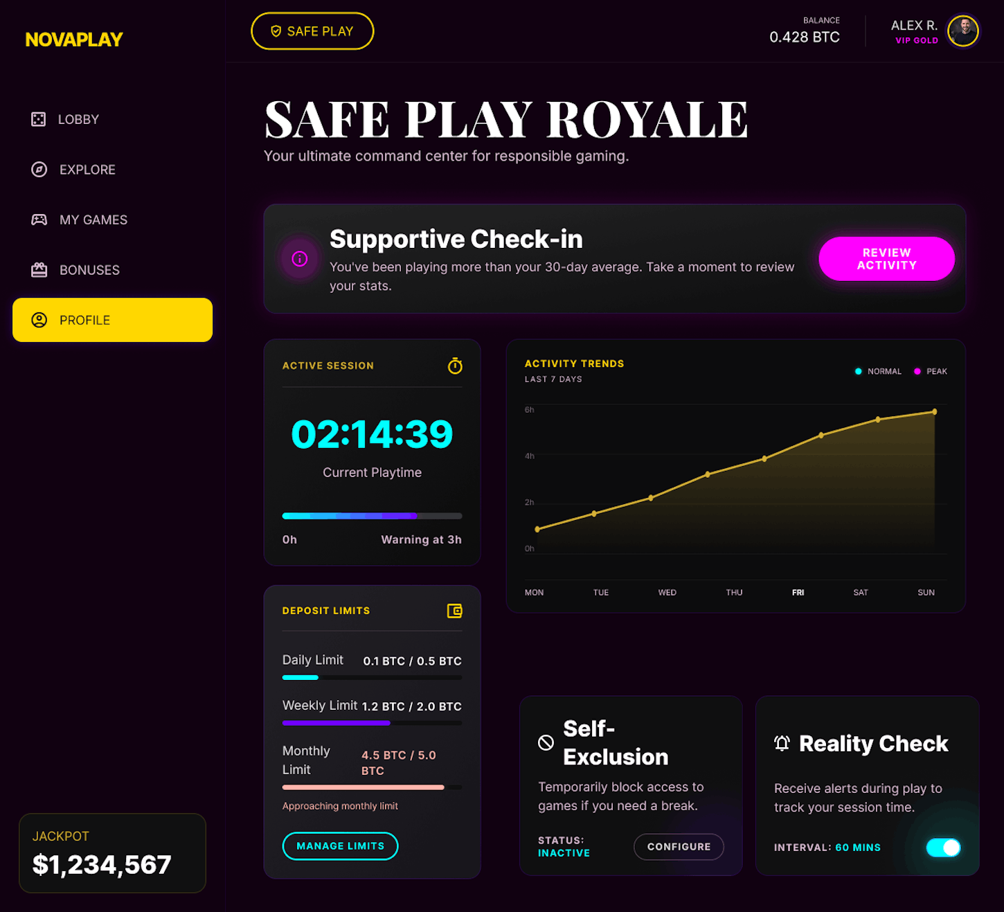
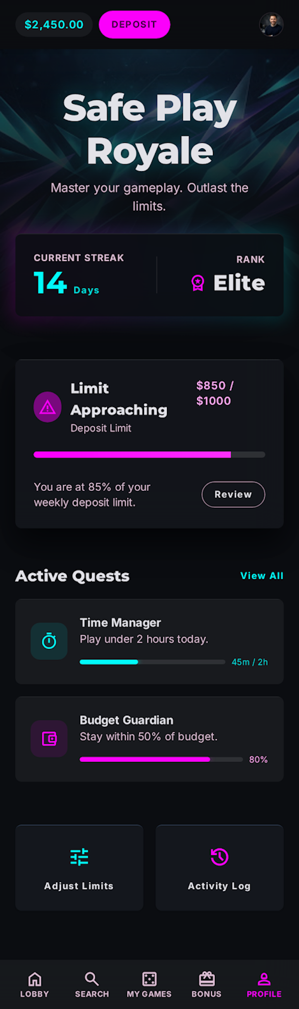
Safe Play sits in the main navigation — the same visual tier as deposits and promotions, not buried three menus down.
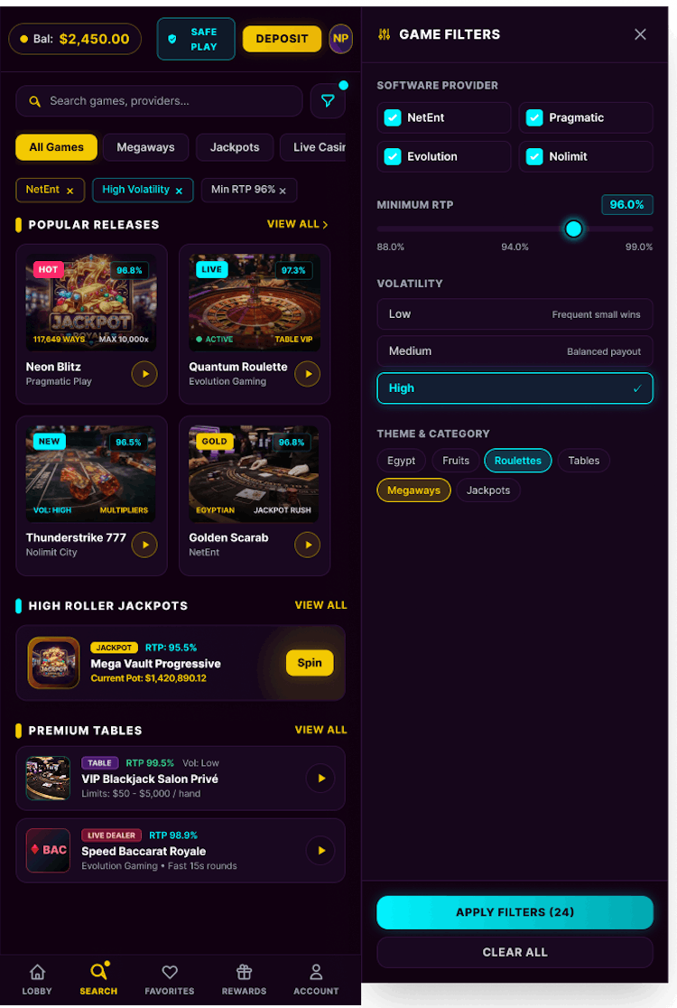
Discovery built around how players actually think — mood, session length, familiarity — instead of rigid provider/genre folders that cause decision paralysis.
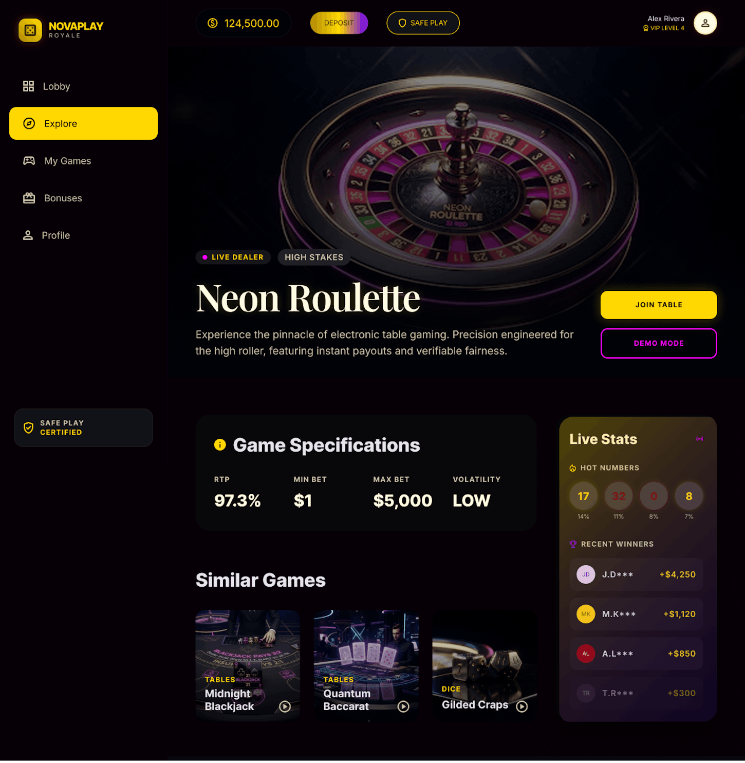
A low-commitment moment to understand a game before spending on it.
Trust beat: information offered before money is asked for.
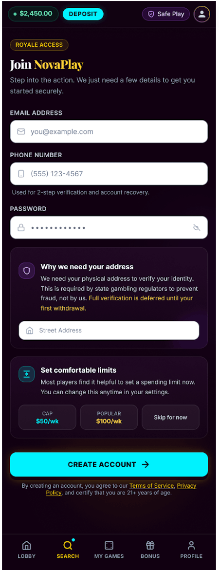
Progressive KYC — minimal info to start, full verification deferred to first withdrawal — with plain-language field explanations instead of blind form-filling:
"We need your address to verify your identity — this is required by regulators, not by us. It takes 10 seconds."
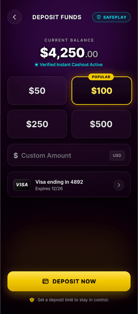
A deposit-limit prompt is introduced here too, early and framed as care rather than a warning:
"Most players find it helpful to set a comfortable limit now — you can change it anytime."
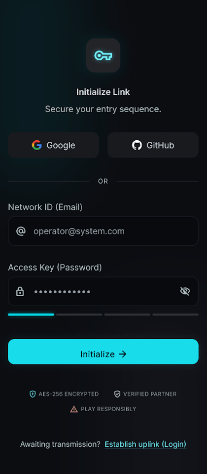
Kept exactly as fast as the industry already got right — the point isn't to slow this down, it's to bring everything else up to this standard.
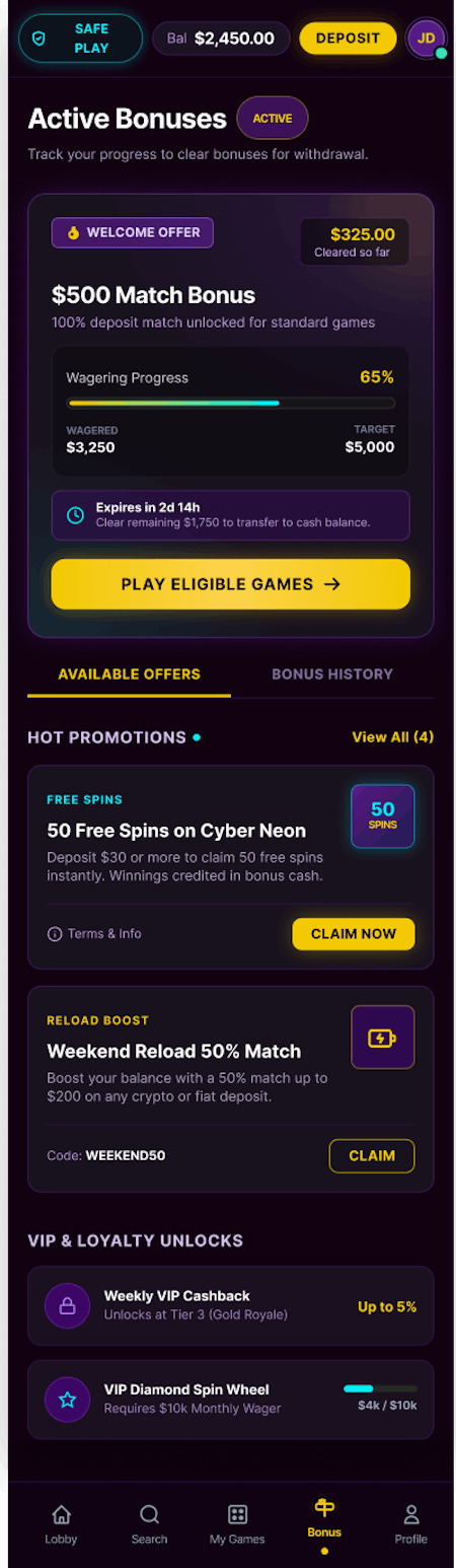
Wagering progress shown live, in the same visual language used elsewhere for status — not buried in a terms page that only gets read after a bonus expires.
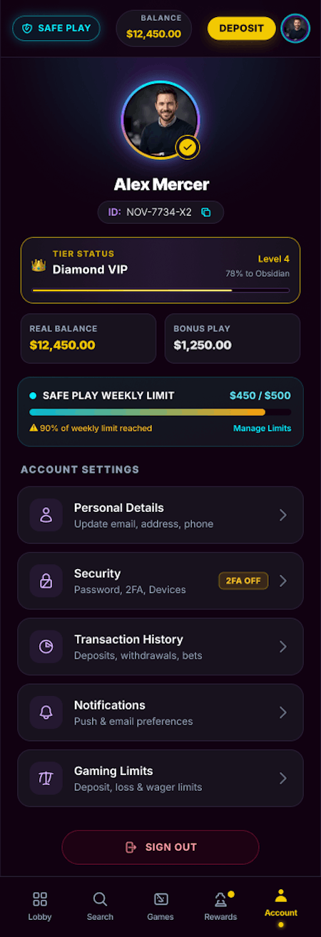
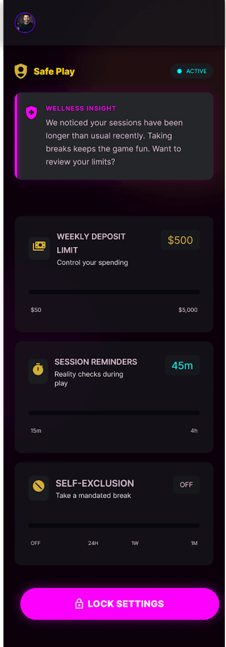
Safe Play sits at the same level as payment methods and personal details — not nested in a settings sub-menu.
If it's important enough to be regulated, it's important enough to find.
The centerpiece. Limits, self-exclusion, and reality checks, reachable in two taps from anywhere — a direct answer to the 4-minutes-vs-8-seconds asymmetry that defines the industry's current standard.
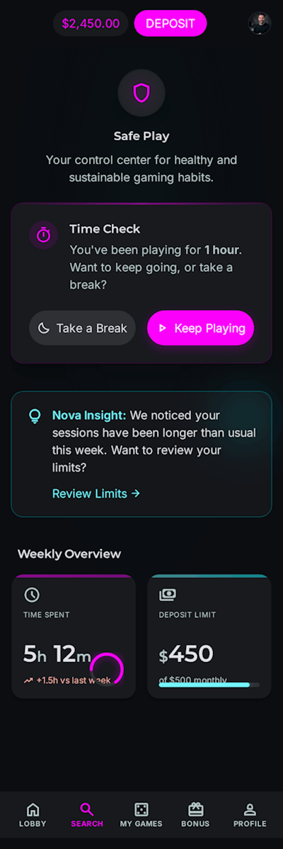
Reality checks are rewritten to remove the legal-notice tone and the built-in bias toward "keep playing":
"You've been here an hour — want to keep going, or take a break?"
Both choices carry equal visual weight — no bold "Continue" next to a grey "Leave."
One quiet addition: a system-detected nudge when play patterns shift from someone's own baseline, offered early and gently rather than after a problem has already formed:
"Your sessions have been longer than usual this week. Want to review your limits?"
Same instinct behind an earlier AI concept of mine for responsible sports betting —
notice early, say it quietly.
Most casino UX case studies stop at one polished screen set.
This is a system, not a single app: the component library — buttons, sliders, progress indicators, alerts — is tokenized for color, type, and iconography while structure, spacing, and interaction patterns stay fixed.
The same core screens hold up reskinned across brand identities, which is what makes the concept extendable to desktop, to other brands, to different regulatory markets, without a redesign each time.
Lower onboarding drop-off, from progressive KYC and transparent field-level explanation.
- Safe Play tools people actually use proactively — because they're visible, not discovered after a problem starts.
- A system an operator could roll out across multiple brands without rebuilding from scratch.
- A defensible position as gambling-UX scrutiny increases, rather than an exposed one.
This started from a pattern I kept noticing across the industry, not a client brief: the parts of a product meant to protect people are usually the least designed parts of the product.
Framing responsible gambling as a design problem, not just a legal one, made for a sharper challenge than another onboarding redesign on its own.
It also connects to a thread through most of my recent work — using AI quietly, in service of the person, not as the headline feature.
The right next step would be usability-testing the limit-setting flow directly: does framing it as care actually change whether someone sets a limit, or does the framing matter less than I'm assuming?
Responsible gambling is not a compliance page.
It is a product-design opportunity.