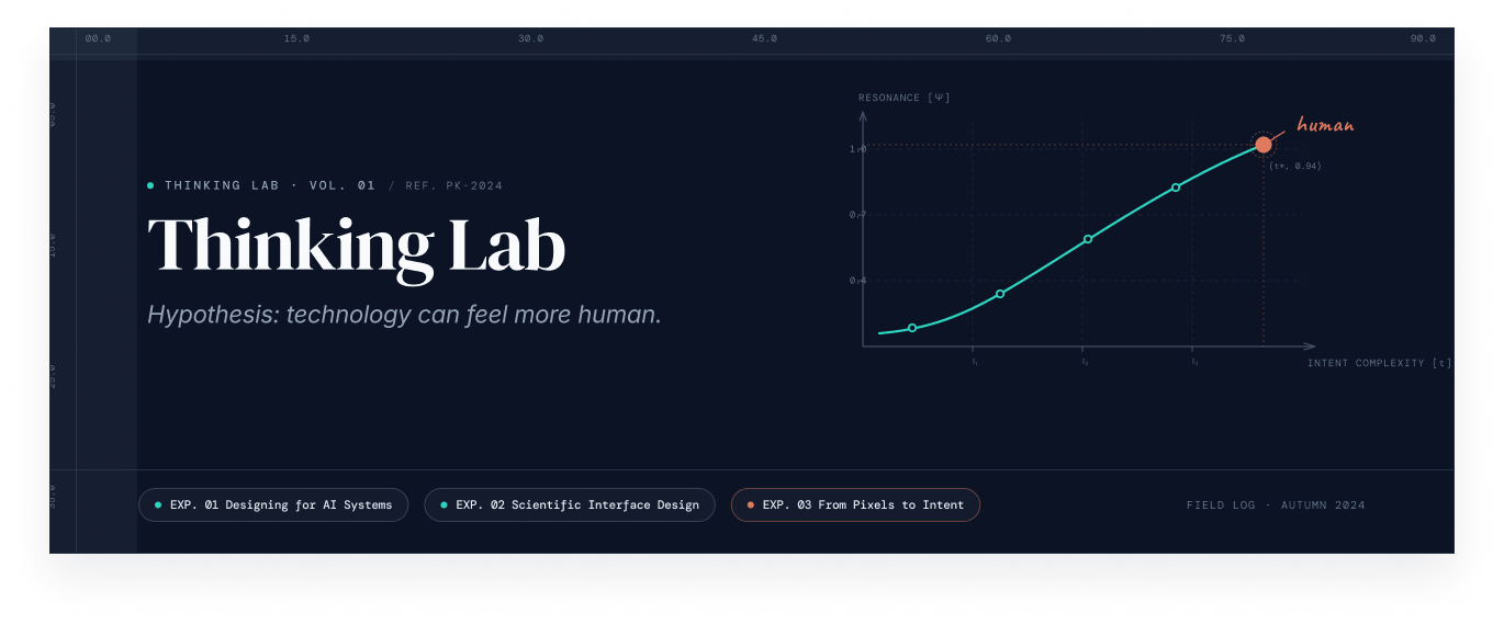
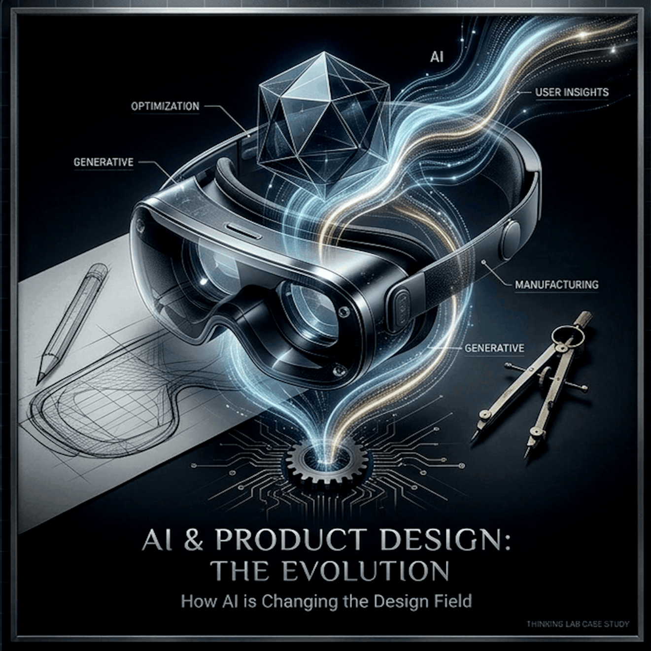
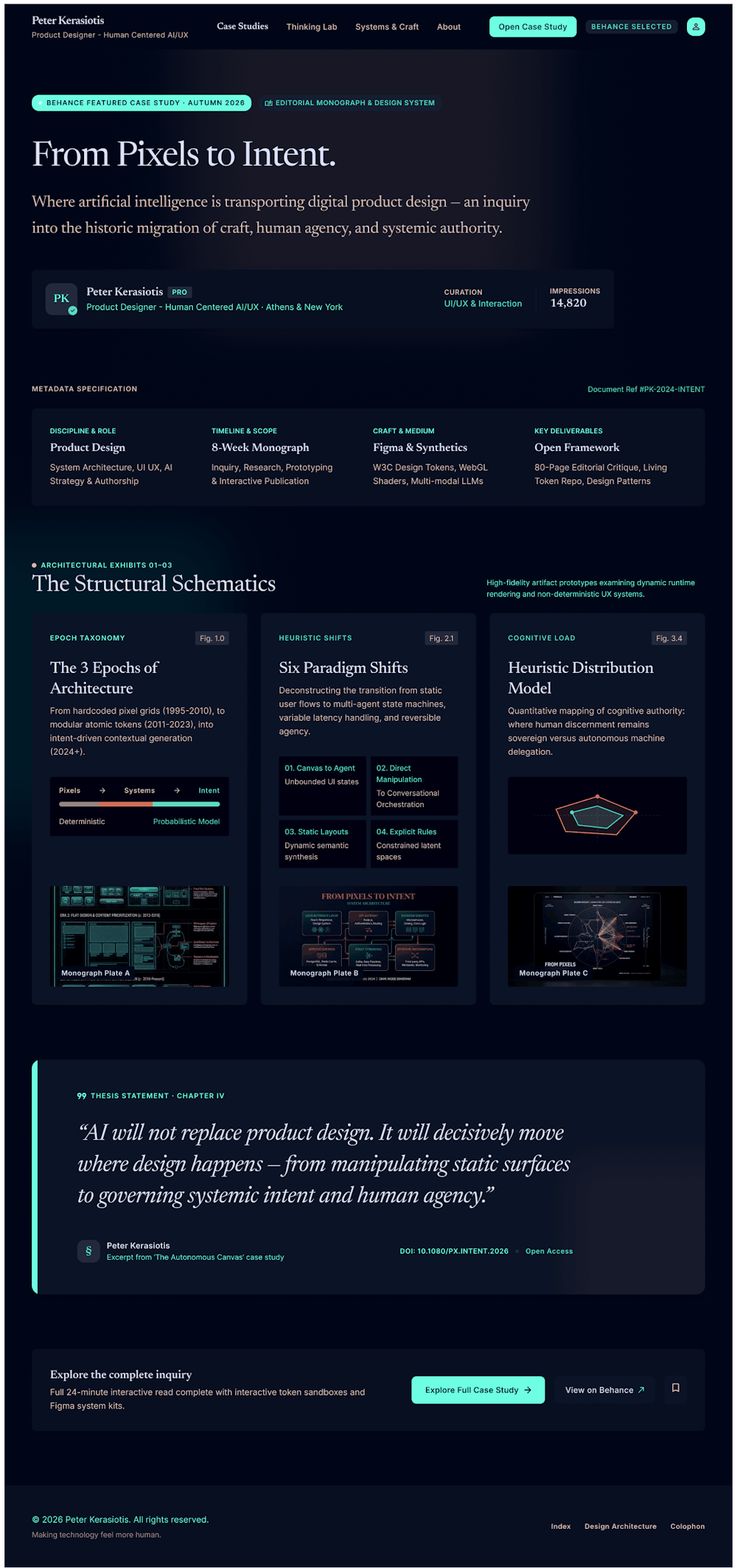
For twenty years, designers have shaped screens.
The next decade is about shaping behavior, meaning what a product does, decides, and remembers when no one is looking at it.
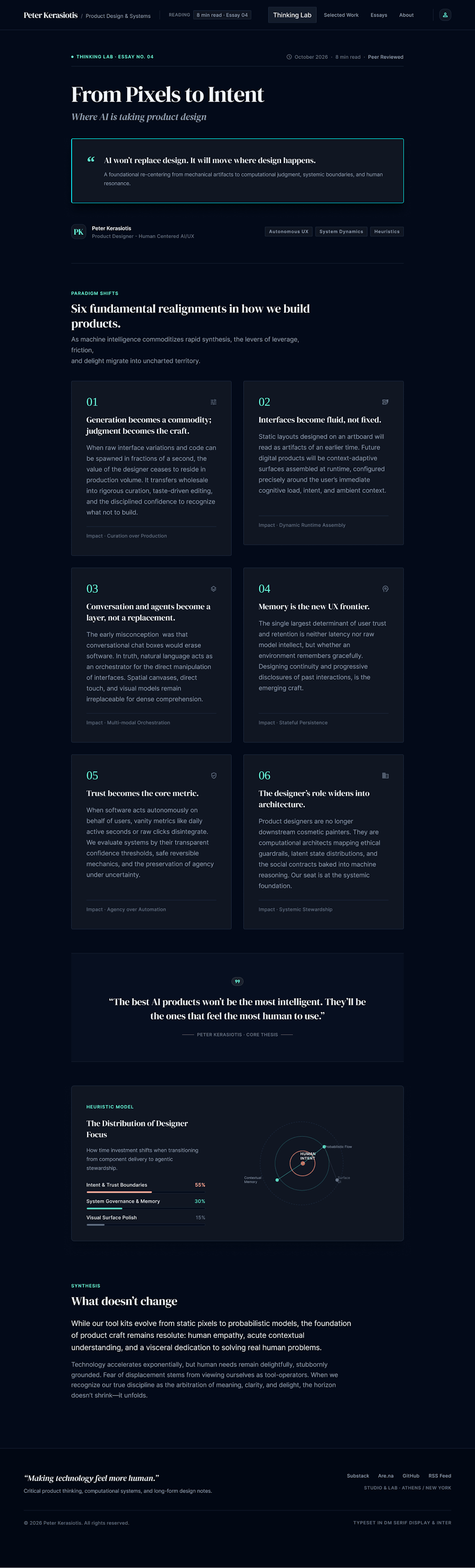
1. Generation becomes a commodity; judgment becomes the craft
Tools like Stitch, Galileo, and Figma’s AI can already produce a plausible screen in seconds. That makes making the interface the quickest part of the job. What stays scarce is knowing which of fifty options is right, why, and for whom. Designers move from producers to editors and directors, and taste, critique, and rationale become the differentiators.
2. Interfaces stop being fixed and start being fluid
Today we design one layout and ship it to everyone.
Increasingly, the interface assembles itself around the person and the moment: different density, different flow, different level of guidance.
The deliverable shifts from a set of screens to a system of rules, components, and constraints that can flex without breaking.
Design systems stop being documentation and become the product’s grammar.
3. Conversation and agents become a layer, not a replacement
Chat is not the end of UI.
It’s a new input that sits beside it.
The hard design problems are in the seams: when should the product ask, when should it just act, and how does it show what it did?
Agents introduce new states we’ve barely designed for: thinking, uncertainty, waiting for approval, acted on your behalf, wrong.
4. Memory is the new UX frontier
A product that remembers is a product with a relationship.
That raises design questions that never existed before: what does it remember, can I see and edit that, how does it forget, and when does remembering feel helpful versus invasive?
Designing memory means designing consent, transparency, and tone over time.
5. Trust becomes the core metric
As products act more autonomously, usability is no longer enough; users need legibility.
Clear confidence signals, visible reasoning, easy undo, and graceful failure become baseline UX.
This is where “responsible design” stops being a niche and becomes the standard:
nudges that serve the user rather than the funnel, and defaults that protect rather than exploit.
6. The designer’s role widens
Designers will increasingly work upstream and downstream of the screen: defining the AI’s behavior and boundaries, writing the principles it follows, prototyping with real models instead of static mocks, and evaluating outputs the way we once evaluated layouts.
The hybrid designer who can think in systems, prompts, and prototypes will have the edge.
What doesn’t change
Empathy, context, and an understanding of human messiness can’t be generated.
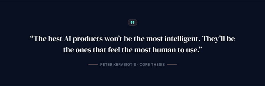
AI can propose, but someone has to care whether the result feels right. The best AI products won’t be the most intelligent; they’ll be the ones that feel the most human to use.
My position: The goal isn’t to design with AI or for AI, but to use it to make technology feel more human.
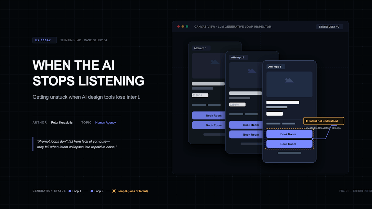
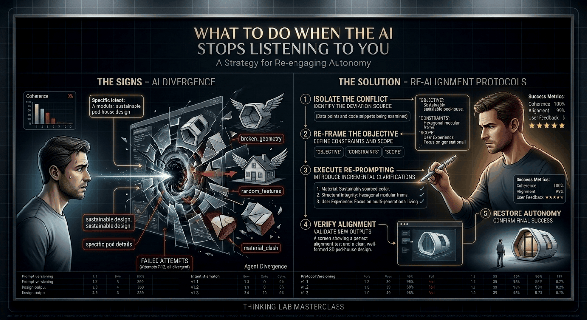
AI tools are excellent for exploration and first drafts, but designers need a method for knowing when to keep prompting, when to reset, and when to finish the work in Figma.
The first hour with an AI design tool is usually great.
You describe a screen, you get something credible in seconds, and it is often better than staring at a blank canvas.
Then comes the moment when the tool stops listening.
You ask for one specific change. It returns the same screen. You rephrase, and it changes something you did not ask about.
You try again, and it slides back to a generic default. Every new prompt adds to the pile, and the output drifts further from what you meant.
What started as a way to get your creative juices flowing, to give you a quicker start, inspire you and even perhaps take you in a new direction, maybe explore an idea or an avenue you did not even think about, has turned into a gridlocked mess, where you feel trapped and there seems to be no way out.
You've already wasted a lot of time, do you discard the whole thing and start from scratch with the old, reliable tools, manually, or do you keep trying to salvage what started off promising but has turned into a big, frustrating mess?
I have seen this also in Google Stitch, which I rate highly, and find it more useful for design exploration than many of the other generators I have tried.
That is why the pattern is worth studying. Even a tool I like reaches a point where more prompting makes things worse.
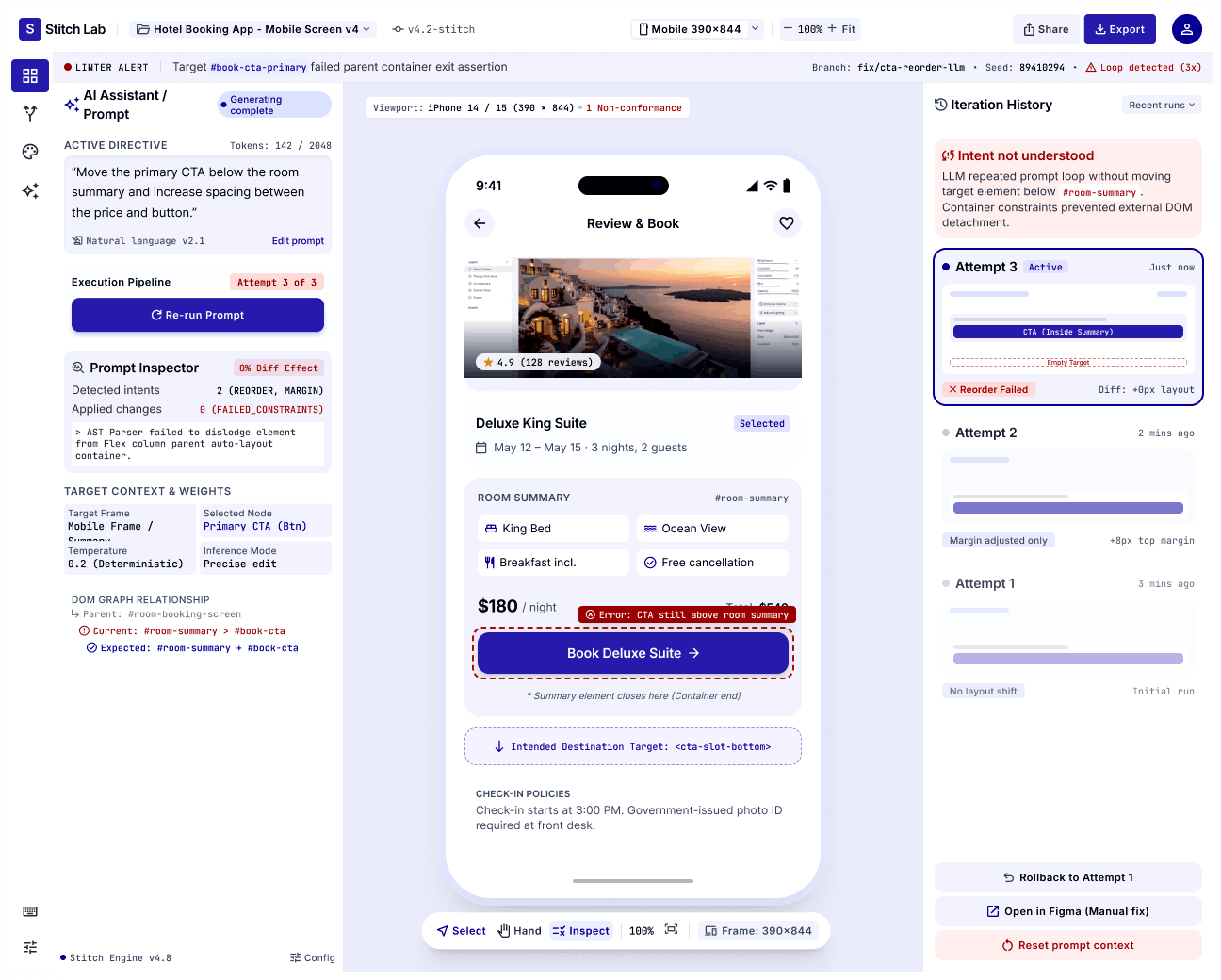
A loop is not only a waste of time. It is a decision trap. The longer you stay in it, the more you have invested, and the harder it is to admit that the fastest route is a different one.
It also affects quality. Tired designers accept “close enough.” A designer who recognizes the loop early keeps control of the result. Knowing when to stop prompting is a professional skill, and almost nobody teaches it.
I cannot see inside these tools, so I treat these as working explanations, not facts about how they are built.
• Long sessions accumulate instructions, and some of them contradict each other.
• A complaint such as “this still looks wrong” gives the tool nothing to aim at, so it falls back on common patterns.
• A request that touches several things at once lets the tool change several things at once.
• The tool’s own earlier output becomes part of the context, including its mistakes.
I treat an AI tool like a fast collaborator with a short memory.
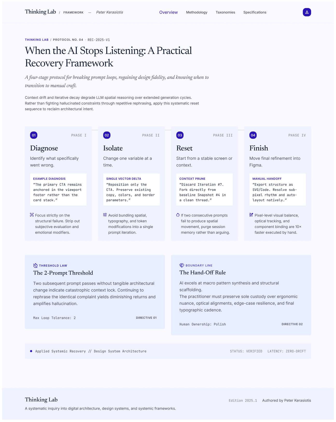
It is good at producing options. It is not good at holding a long chain of precise instructions. So at every step I choose between three moves: continue prompting, reset, or finish manually.
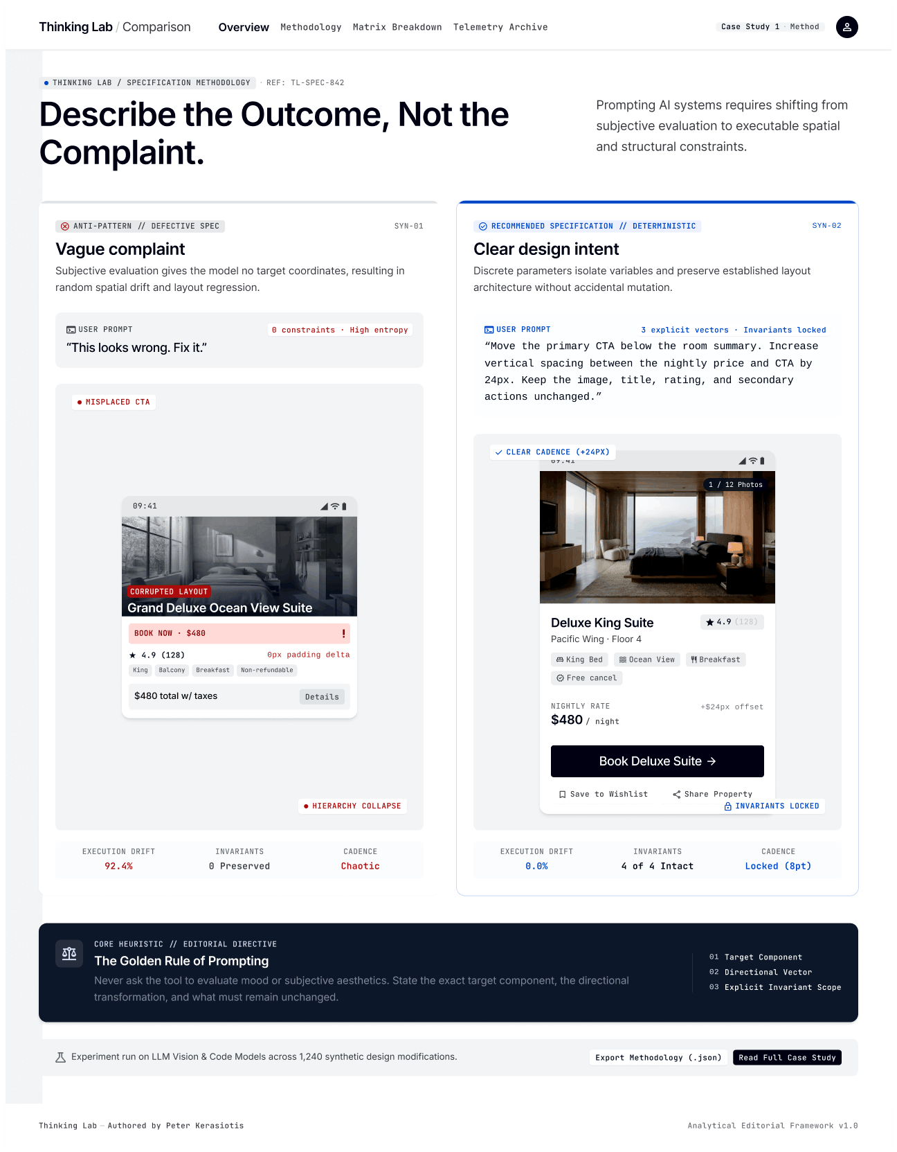
1. Describe the outcome, not the complaint. A complaint says what is wrong. An outcome says what should be true.
• Complaint: “This card is still too cluttered.”
• Outcome: “Show three items in the summary card: room type, dates, and total price. Move everything else behind a ‘Details’ link.”
(These are illustrative prompts, not captured from a specific session.)
2. Change one variable at a time. If you change the layout, the color, and the copy together, you cannot tell which change caused the problem. One change per prompt makes the result easy to judge and easy to undo.
3. Give the system something to hold. Constraints, references, component names, and success criteria all narrow the tool’s room to guess. For example: “Do not change the header or the color palette. Edit only the booking summary card. Success: price and dates are visible without scrolling on a 390 pixel wide screen.”
4. Reset from a stable screen. When a session is tangled, do not fight it. Save the last version you were happy with, start a fresh conversation, and describe that screen plus the one change you need. A clean start often beats ten more corrections.
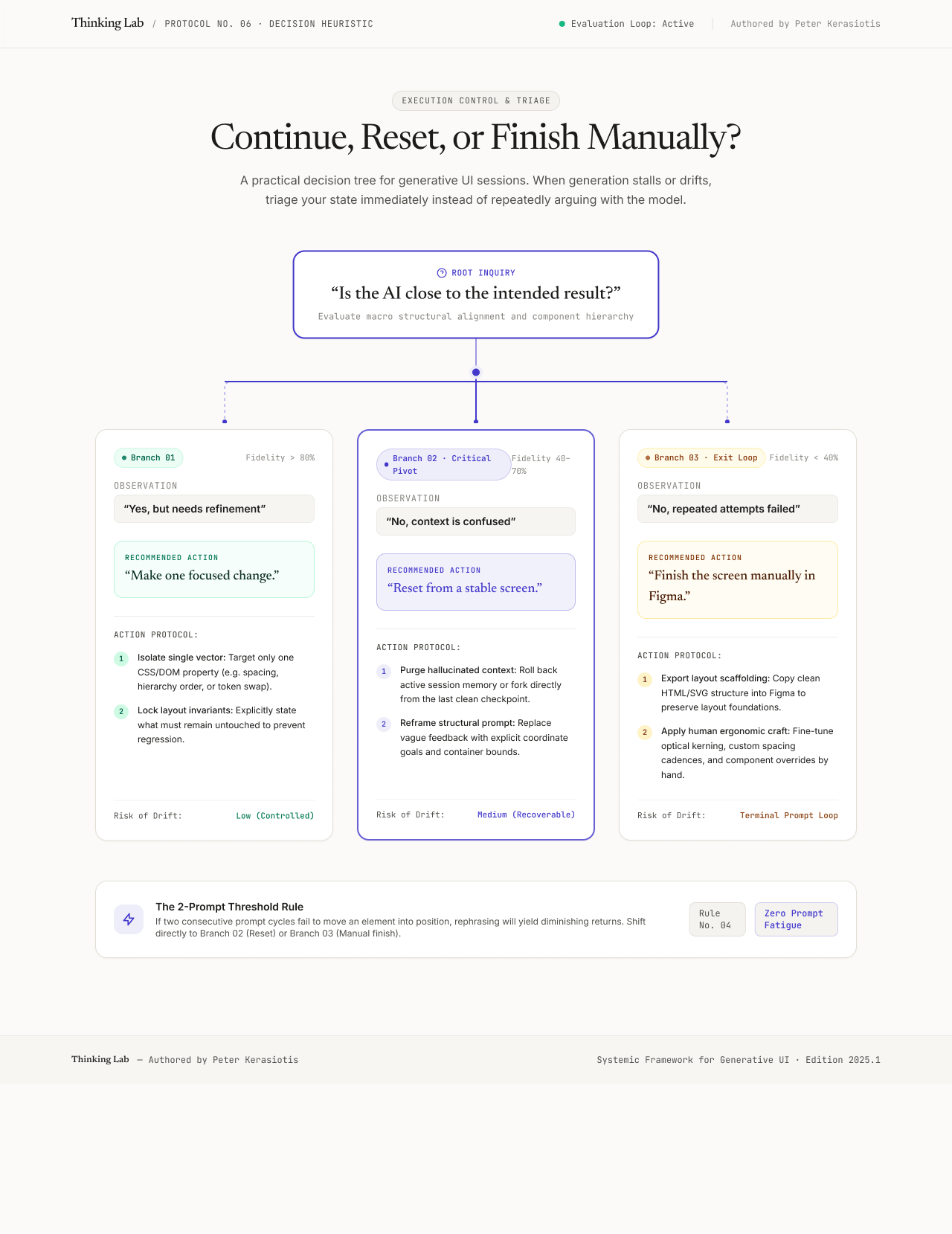
Continue prompting.
The last result moved closer, even slightly. The change is a single variable. Only the area you named is changing.
Reset
The same error appears after you rewrote the prompt. New problems appear in areas you did not touch. The tool keeps returning to a default look. The session has become long.
Finish manually in Figma.
The remaining work is precision work: spacing, alignment, type scale, component states, accessibility details. You have already reset once and it still loops.
My working rule is simple. Two prompts with no progress means reset. One reset with no progress means open Figma. It is a rule of thumb, not a law, but it stops loops early.
AI UI generators
Fast, and strong for exploring directions. Less reliable for precise control over long sessions.
Browser-based app builders
Quick working prototypes. The code is often hidden, so it can be hard to see why something breaks.
AI code editors
More control, because you work with real files and can inspect every change. They need comfort with code and are built for building, not visual exploration.
Traditional design tools
Precise, predictable, and strong for components and systems. Slower for a first draft.
Write the success criteria before the first prompt, not after the third.
Save a named, stable version every time I am happy, so a reset costs minutes.
Set the two-prompt rule at the start of a session, when I am still objective.
Treat a loop as information about the tool, not a puzzle I have to solve.
AI tools are strong for exploration and weak at long chains of precise instruction. The skill is not better persistence. It is knowing which of three moves the moment needs.
1. Can I state what I want as an outcome, not a complaint?
2. Am I asking for one change only?
3. Have I named the component and said what must not change?
4. Do I have a success criterion I can check?
5. Have I tried twice without progress?
6. Do I have a stable screen to reset from?
7. Would this take less time to finish in Figma?
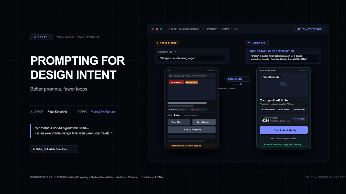
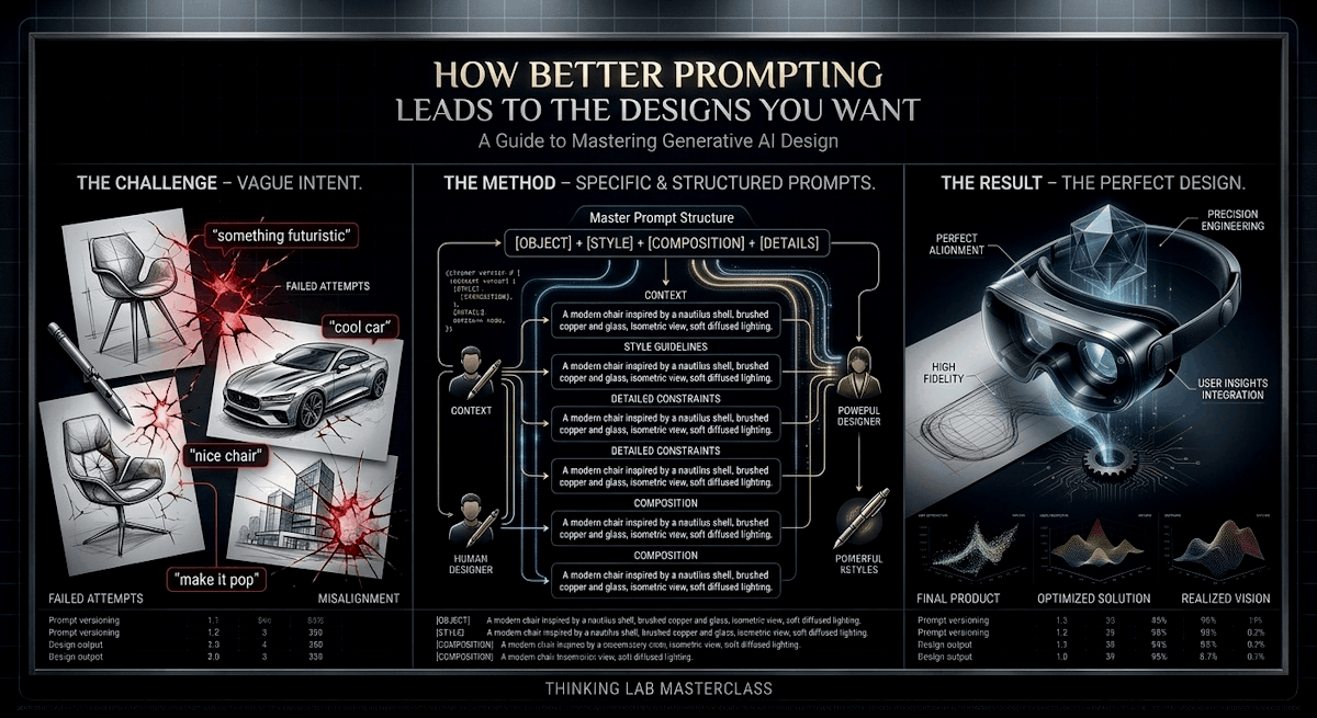
“Design a hotel booking page.”
Type that into any AI design tool and you will get something that looks like a hotel booking page. A hero image, a search bar, a grid of cards. It is not wrong. It is average.
That is the problem with vague prompts. Every gap you leave, the tool fills with the most common choice. The result is generic, so you start correcting it, and the corrections turn into the loops described in the "When AI stops listening" case study.
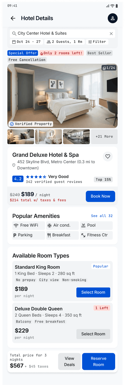
A designer’s value sits in the decisions: who the page is for, what matters most, what should stay quiet. If the prompt does not contain those decisions, the tool makes them, and you spend your time undoing them.
A good brief moves the thinking to the start, where it is cheaper. It also makes the work easier to explain to a colleague or client, because the intent is written down.
Write the brief first, then turn it into a prompt. The brief is the same document I would give a human designer. The prompt is that brief, written plainly enough for a tool to follow.
1. Audience and context. Who is using this, and in what situation?
2. User goal. What are they trying to get done?
3. Business or product goal. What does the product need from this screen?
4. Platform and constraints. Device, screen width, grid, design system, components.
5. Content hierarchy. What matters first, second, and third?
6. Primary and secondary actions. One main action, and what supports it.
7. Visual direction. Mood, color, type, imagery, density.
8. Accessibility and tone. Contrast, text size, touch targets, and how it should sound.
9. Definition of success. How will I know the result is right?
10. What must not change. Anything already approved.
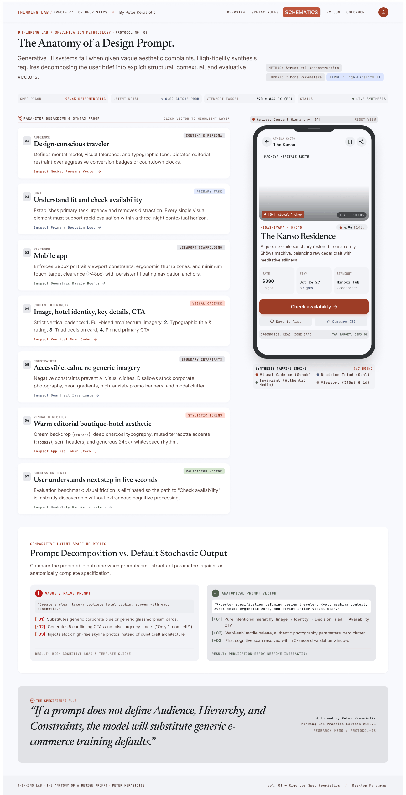
Weak prompt:
Design a hotel booking page.
Stronger prompt: (illustrative):
Design the booking page for a boutique hotel. Audience: travellers booking a three-night stay, mostly on their phones, often comparing two or three hotels. User goal: choose dates, see the total price and cancellation terms, and reserve with confidence. Business goal: encourage direct bookings. Platform: mobile web, 390 pixels wide, 8-point grid, single column. Hierarchy: dates and guests first, then room options with price, then policies. Primary action: “Reserve room.” Secondary action: “Ask a question.” Visual direction: warm, editorial, restrained, one accent color, photography placeholders. Accessibility and tone: WCAG AA contrast, 16 pixel minimum body text, touch targets of at least 44 pixels, plain friendly language, no countdown timers or pressure tactics. Success: a traveller can reach the total price and cancellation terms without leaving the page. Do not change: the header and the color palette from the previous version.
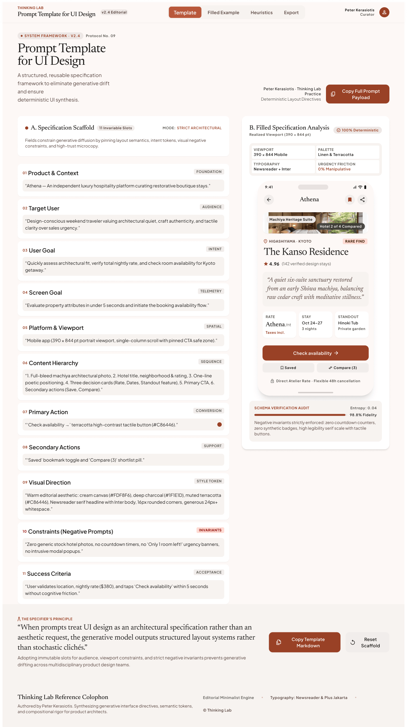
Design a [screen or flow type] for [product].
Audience and context: [who, where, in what situation]
User goal: [what they are trying to do]
Business or product goal: [what the product needs]
Platform and constraints: [device, width, grid, design system, components]
Content hierarchy: [first, second, third]
Primary action: [one]
Secondary actions: [list]
Visual direction: [mood, color, type, imagery, density]
Accessibility and tone: [contrast, text size, touch targets, voice]
Success looks like: [a check I can perform]
Do not change: [approved elements]
Landing Page
One message, one action, and the order of proof and detail
Mobile App Screen
Thumb reach, states, platform conventions, one-handed use
Dashboard
The decision the viewer makes, which numbers lead, density, empty and loading states
Onboarding flow
What is asked and why, how to skip, how to go back
Marketing Campaign Page
Campaign goal, audience segment, tone, one conversion action, brand consistency
AI-Assisted Product Feature
What the AI can do, what it cannot do, how the user stays in control, what happens when it is wrong
The last row needs the most care. Take the soft check-in in the NovaPlay Safe Play and Smart Slip dashboards. The brief for it is not mainly about layout. It is about tone: non-judgmental, easy to dismiss, no pressure to act, and a clear path to support.
The Prompt Template used for the Athena AI project.
Write “do not change” from the first prompt, not after the first regression.
Keep briefs in a library and version them like design files, so a good brief gets reused.
Test a brief on a person first. If a colleague cannot tell what to build from it, a tool will struggle too.
Stop adding adjectives. “Modern, clean, premium” says little.
A reference, a constraint, or a named component says more.
A prompt is a small design brief. The more of your decisions it carries, the fewer the tool makes for you, and the fewer loops you have to climb out of.
Most of the conversation about AI and design is about speed.
How fast a screen can be generated, how many variations you can see before lunch. The speed is real, and I use it.
But speed answers how interfaces get made. It does not answer whether they are right. When a screen appears in seconds, the questions that matter do not get answered faster: who is this for, what happens when it is wrong, and who is accountable.
They just get skipped more easily.
There is a second layer. AI is increasingly part of the product, not only part of the toolchain. A booking assistant, a dashboard that flags patterns in behavior, a recommendation.
Designing those means designing behavior, not just screens.
Mistakes in AI features carry different consequences from layout mistakes.
A misaligned button is annoying.
An assistant that books the wrong thing, or a system that misreads someone’s behavior, affects a real person.
Users cannot see how these systems decide.
They rely on the interface to tell them what is happening and to give them a way out.
That interface is the designer’s work.
I separate three questions.
What does AI genuinely improve in how I work?
What does it not solve?
And, given both answers, what do I now need to own more deliberately?
Exploration. More directions, earlier, at low cost.
First drafts. A credible starting point instead of a blank canvas.
Variation. Quick alternatives for layout, copy, and tone.
Prototyping. Faster first passes through notes and feedback, as long as I check them against the source.
Content generation. Placeholder and draft copy that makes a design feel real.
Production support. Repetitive tasks that used to eat hours.
Business intent. A tool does not know what the product needs.
User context. It does not know who is tired, anxious, or in a hurry.
Ethical tradeoffs. It can optimize a number without asking whether it should.
Accessibility. A polished screen can still fail contrast, focus order, or screen reader use.
Information architecture. Screens can look coherent one by one while the structure across the product falls apart.
Brand coherence. Generated work drifts toward the average of everything.
Accountability. A tool cannot be responsible for an outcome. A person can.
Consequences of errors. Someone has to decide what happens when the system is wrong.
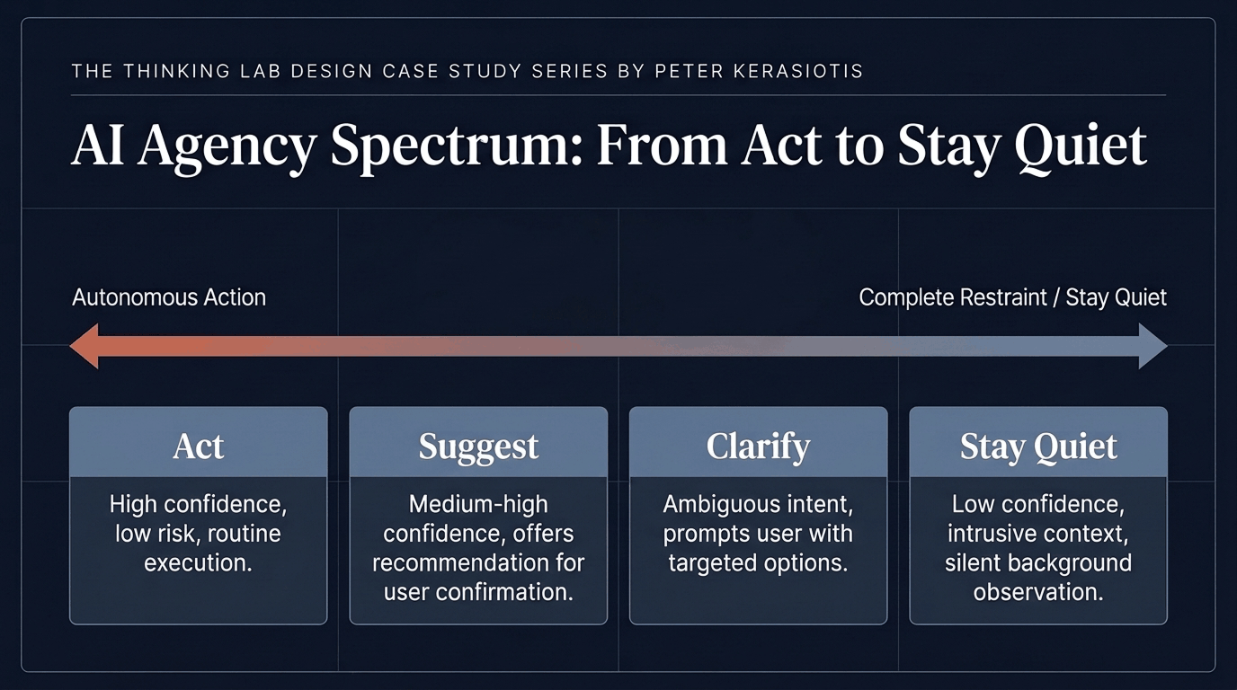
Deciding when AI acts, suggests, clarifies, or stays quiet. This is a design decision, and it deserves a deliberate answer for every feature.
Act. Do it without asking. Only for low-stakes actions that are easy to reverse.
Suggest. Offer, and let the person decide.
Clarify. Ask a question when the request is ambiguous.
Stay quiet. Hold back when speaking up would be intrusive or when the system is not confident.
In my NovaPlay concept, the AI-driven moment in the Safe Play dashboard is a soft check-in that surfaces when play patterns change. It is not a block and not a warning. It suggests, and the person stays in charge.
NovaPlay and Smart Slip also each have an operator dashboard where trained staff can view player behavior and decide when and how to intervene. The system surfaces what it sees. A trained person decides what to do about it. That is escalation to a human, designed in from the start.
Designers also own four other things:
Designing for uncertainty and failure
Preserving user agency
Making system behavior understandable
Making sure the outcome works for people who are not the “average” user.
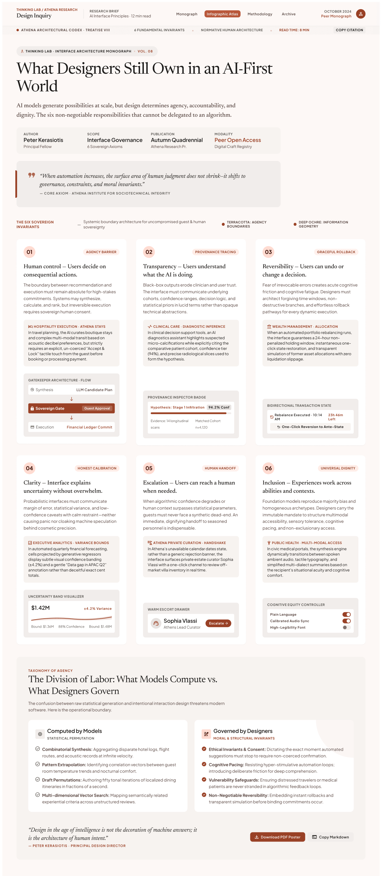
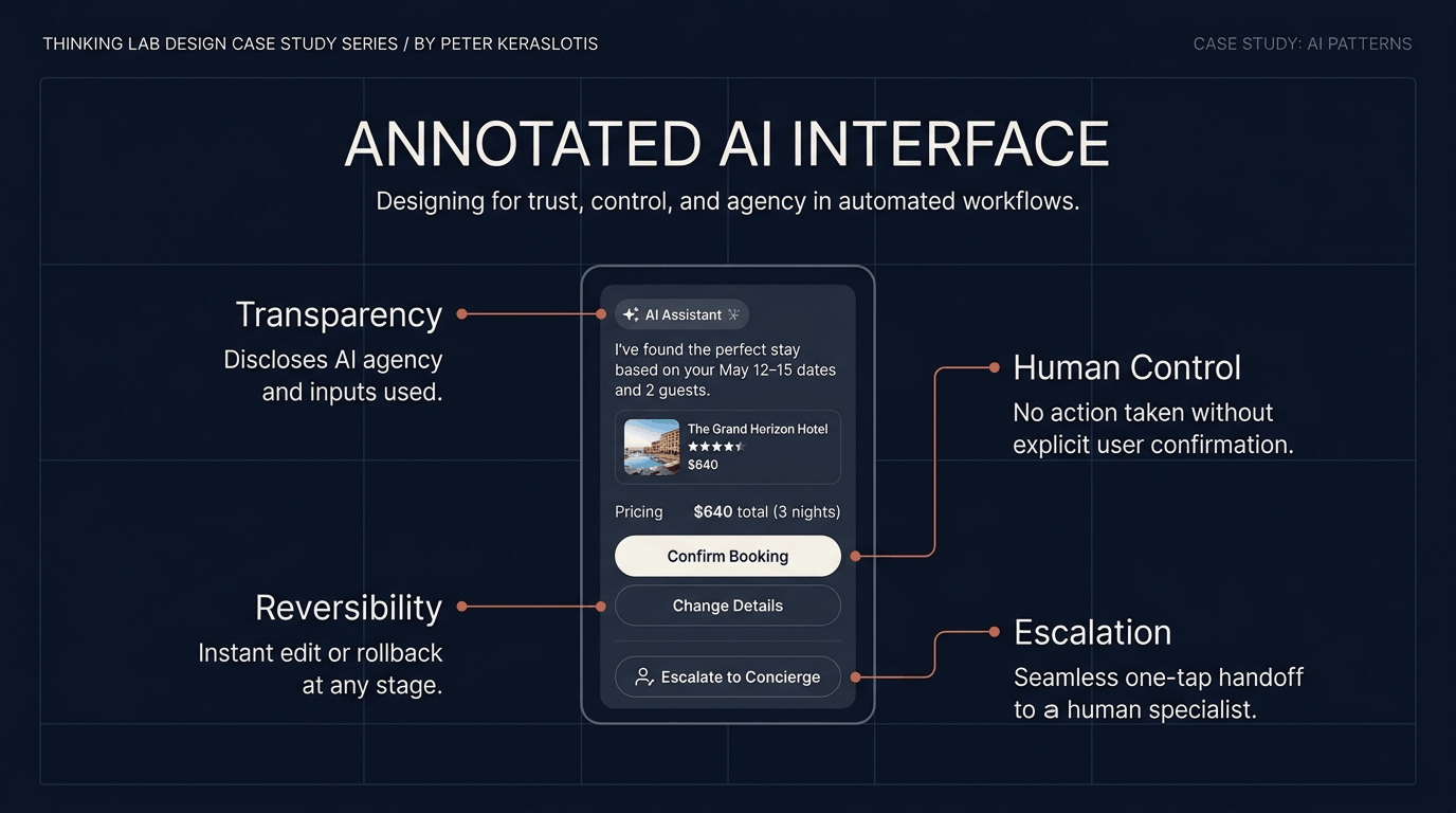
Human control for consequential actions. Payments, bookings, deletions, and anything hard to undo, need an explicit confirmation.
A conversation feels casual, so in a conversational booking experience like Athena AI the moment of commitment has to be unmistakable.
Transparency. Say what is AI, what it used to reach an answer, and what it cannot do.
Reversibility. Let people undo, edit, and cancel.
Progressive disclosure. Keep the default simple, and make the reasoning available for people who want it.
Clear escalation to a human. A visible path to a person, not a link buried in a footer.
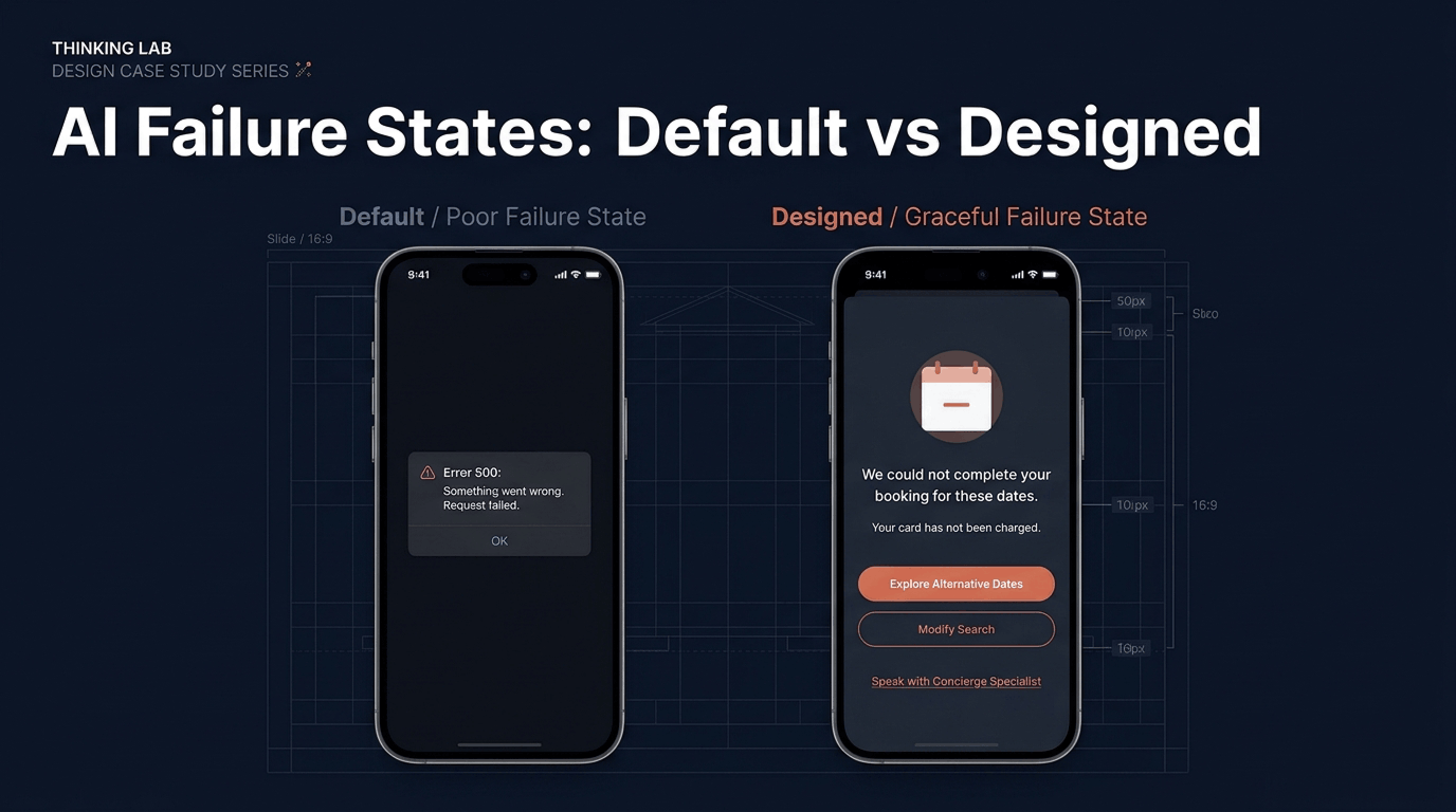
Failure states. Design for wrong, slow, unavailable, and unsure. If a feature has no designed failure state, it is not finished.
Prompt literacy. Writing briefs a tool can follow, as explored in the Design Prompting case study.
Systems Thinking. Seeing the behavior of the whole, not one screen at a time.
Information architecture. Structure is the part generators handle least well.
Research judgment. Knowing which findings to trust, and how to test them.
Accessibility. Checking generated work before falling for how it looks.
Critical evaluation of output. Asking of every result what it assumed, what it skipped, and who it leaves out.
Design failure and escalation states at the same time as the happy path, not after.
Put “who decides?” on every AI feature brief.
Write down what the AI is not allowed to do as clearly as what it is allowed to do.
Run accessibility checks on generated work before I get attached to it.
AI should augment human judgment, not replace it.
The designer’s role is shifting from producing every artifact by hand to directing systems, setting constraints, evaluating outputs, and protecting the human experience.
The tools will keep changing.
The responsibility does not.
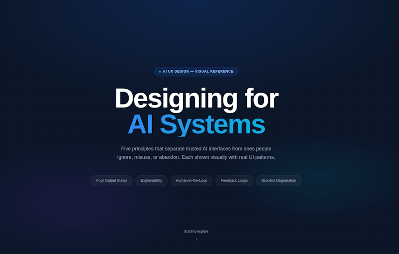
Designing an AI product means designing something that behaves, not just something that looks a certain way. The screen is the smaller part of the problem. The bigger part is deciding how the system speaks, when it asks versus acts, how sure it should sound, and what happens when it’s wrong. These behaviors become the product’s personality, and users form a relationship with that personality long before they notice the layout.
The craft changes accordingly. The new design materials are states and boundaries: what the system is doing right now, what it’s unsure about, what it remembers, and where a human must step in.
A good AI interface makes all of this legible, with visible reasoning, clear confidence signals, easy correction, and a graceful path when the model fails.
The goal isn’t to hide the intelligence but to make it understandable.
Evaluation changes too. We can’t just test whether someone completes a task; we have to test whether they trust the system appropriately, neither blindly nor not at all.
Designing for AI means shaping that trust on purpose, because it’s the thing every other metric depends on.
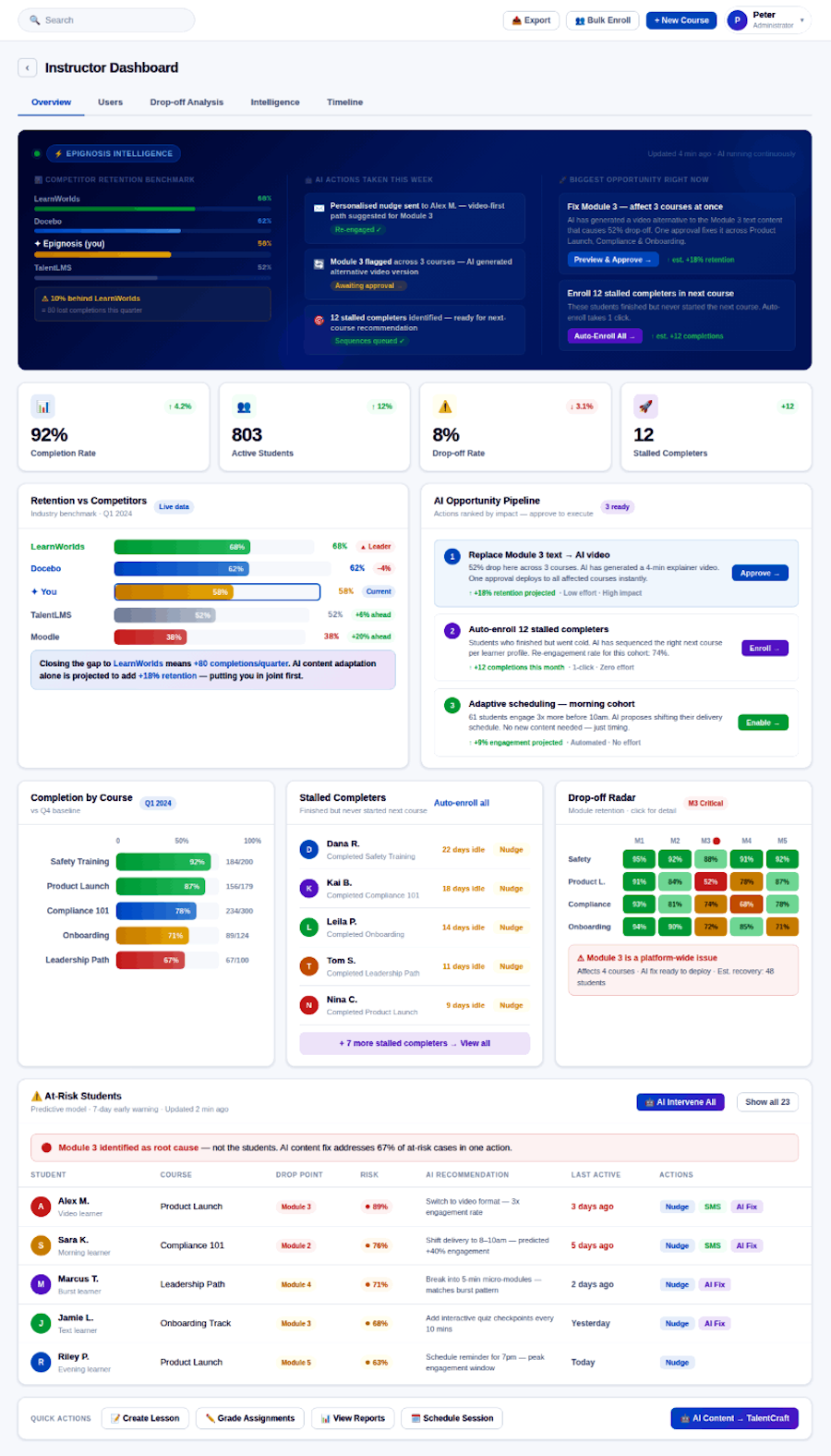
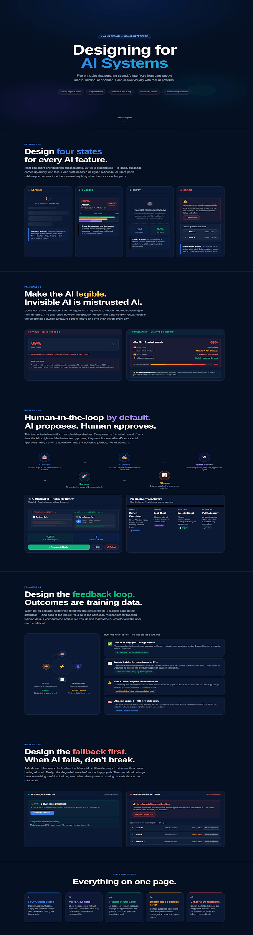
What got me thinking about how to design for AI systems is a proposal I did for Epignosis, a SaaS software company specializing in eLearning and HR technology, offering cloud-based LMS platforms.
This proposal for Epignosis, a SaaS software company specializing in eLearning and HR technology, offering cloud-based LMS platforms, is specifically for their flagship product, TalentLMS -the LMS platform they built and sell.
I did a deep dive into the product and into the entire LMS space, comparing the various competitors, their pain points, advantages/disadvantages and how they were implementing AI to improve their product and customer satisfaction/retention.
In the case of Epignosis, which was my focus, TalentLMS currently sits at 58% course completion, trailing LearnWorlds at 68% and Docebo at 62% — a gap that translates to approximately 80 lost completions per quarter.
My dashboard analysis identified three compounding causes of drop-off:
- Format mismatch, where learners with strong video engagement patterns are being served text-heavy modules, particularly at Module 3 which shows a 52% retention collapse across multiple courses.
- Timing problem, where a significant cohort of morning learners are receiving content outside their peak engagement window.
- Momentum gap, where 12 students who completed a course never progressed to the next one, not because they disengaged, but because no pathway nudge existed.
The proposed AI intelligence layer (3 agents) addresses all three without requiring new content to be created from scratch —
The predictive churn model flags at-risk learners seven days before they drop.
The content adaptation agent uses TalentCraft AI (their existing AI) to reformat existing modules into the learner's preferred format with one instructor approval.
The personalization agent adjusts delivery timing and sequencing automatically.
Modelled conservatively, closing just half the gap with LearnWorlds recovers 40 completions per quarter; the optimistic case, where all three AI interventions are active, projects an additional 120 completions — which, depending on course value, represents a measurable and attributable revenue recovery from content that already exists.
I delivered my findings and proposal with a dashboard and presentation/microsite, I am including below.
Scientific interfaces serve people who can’t afford ambiguity. Researchers and lab teams work with dense, high-stakes data, and a misread value or a hidden assumption can cost weeks of work. Here, clarity isn’t a visual preference; it’s a requirement of the work. The design job is to keep complexity visible and manageable instead of simplifying it away.
That means respecting expert users. They want precision, control, and speed, and they tolerate learning curves that consumer products never could, as long as the payoff is real. Good scientific design shows units, sources, and uncertainty alongside the numbers, preserves a clear trail of how a result was produced, and lets experts move between overview and detail without losing their place.
AI raises the stakes further. When a model suggests an analysis or flags an anomaly, the interface has to show how it got there and how confident it is, so the scientist stays in charge of the conclusion. The best scientific tools don’t replace judgment; they give it better evidence and a clear view of what is known, what isn’t, and why.
Never having thought of scientific interface design before, I got really into it when I pitched a proposal to Deus Ex Machina and in order to do so, I took a deep dive into the field and was surprised by what I found.
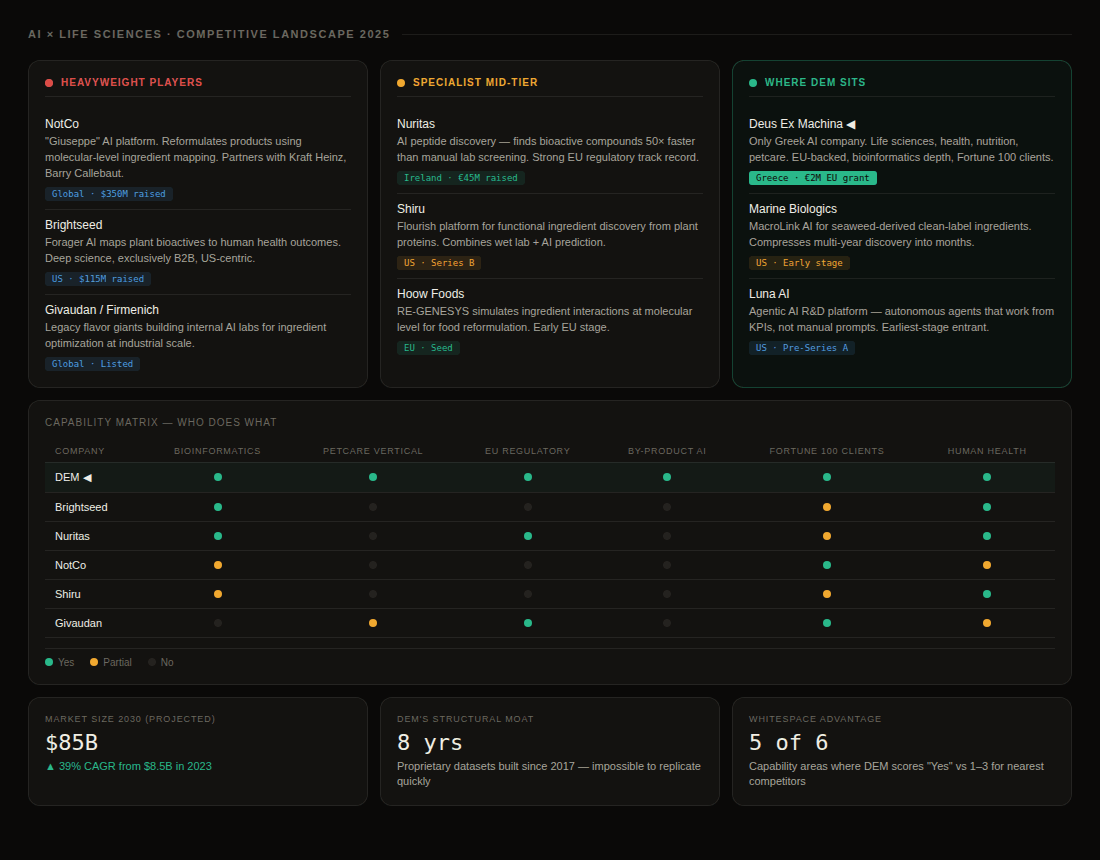
Deus Ex Machina is Greece's first AI company, founded in Athens in 2017.
They build artificial intelligence platforms for the life sciences, human health, nutrition, and petcare industries — helping research and development teams at Fortune 100 companies solve a problem that has historically taken years and cost millions: figuring out which ingredients to put in a product, at what dose, in what combination, and whether it is legal, safe, and scientifically defensible in every market they want to sell in.
Their AI reads hundreds of thousands of research papers, patent filings, and regulatory databases simultaneously and surfaces answers in hours that a human team could not reach in months.
In 2024 they received a €2 million EU grant to build an ingredient upcycling platform — converting food industry by-products into validated, commercially viable ingredients using AI.
They operate at the intersection of bioinformatics, machine learning, and regulatory science, and they have no peer in Europe doing what they do at this breadth.
The science works. The product is real. Their possibilities are limitless.
The problem is that everything DEM has built was designed by engineers for engineers — and their users are not only engineers.
A research scientist, a product manager, a regulatory affairs officer, and a Fortune 100 client's chief financial officer all need to interact with the same AI output, and right now the interface does not speak to any of them clearly or specifically.
There is no design system, no visual hierarchy, no narrative layer that translates AI confidence scores into human decisions.
The platform functions. It does not communicate.
And for a company whose entire value proposition is making the impossible legible, that gap is the single most important challenge they have.
In order to better understand the space, I took a look at the product AG1 and how the DEM model could actually help them. I saw AG1 as a potential Fortune 100 client. The case study is a fictional but plausible scenario built to illustrate what DEM's platform could do for exactly that type of client. The science is real, the regulatory problem is real, the ingredient interactions are real — but the engagement between AG1 and DEM is invented. The case study is a speculative case study — fictional client engagement created to demonstrate the platform's capability
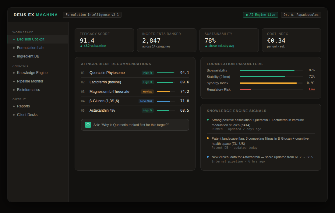
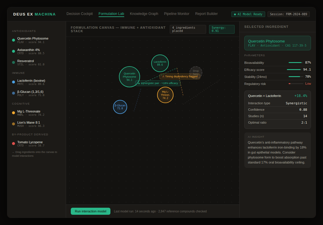
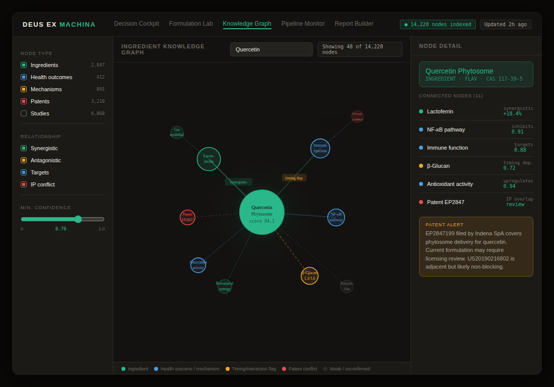
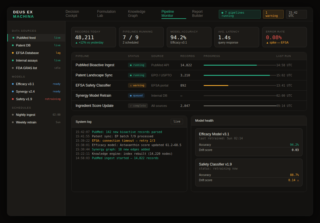
This is a speculative design proposal exploring what a purpose-built product design system for DEM could look like — created as part of an ongoing research process into AI-native UX and scientific interface design. The work comprises five interconnected surfaces:
- Decision Cockpit giving scientists an at-a-glance command center for AI-ranked formulation intelligence;
- Formulation Lab where ingredients are dragged onto a canvas and interaction modelling runs live;
- Ingredient Knowledge Graph visualizing the relationships between compounds, health outcomes, mechanisms, and patent risks;
- Pipeline Monitor giving the data team real-time visibility into ingestion, model health, and system status;
- Competitive Landscape providing strategic context on the AI life sciences market.
Together they represent a single coherent product language — one that makes a €2 million AI engine feel as clear and trustworthy as the science behind it.